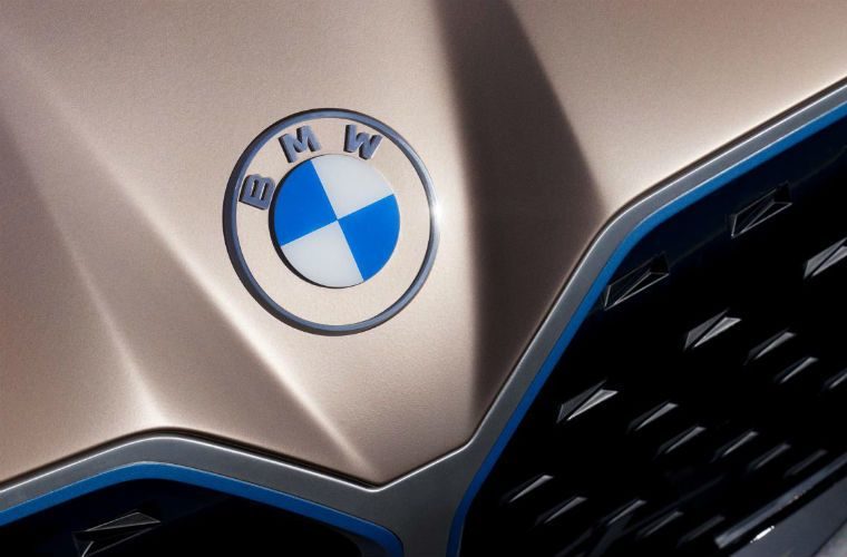
BMW has unveiled a new two-dimensional and transparent logo on its Concept i4.
The centre retains the blue and white colours of the Bavarian state from which the company originates but the black outer circle bordering the crest is transparent, while a retro font also spells out the letters BMW.
The new design will be used for corporate communications, events, car show stands, and media branding but the current logo will be used on its cars.
The German carmaker says the new logo is “better-suited to the digital age,” claiming the pared-down, two-dimensional design “conveys openness and clarity.”
Share your comments below.


